

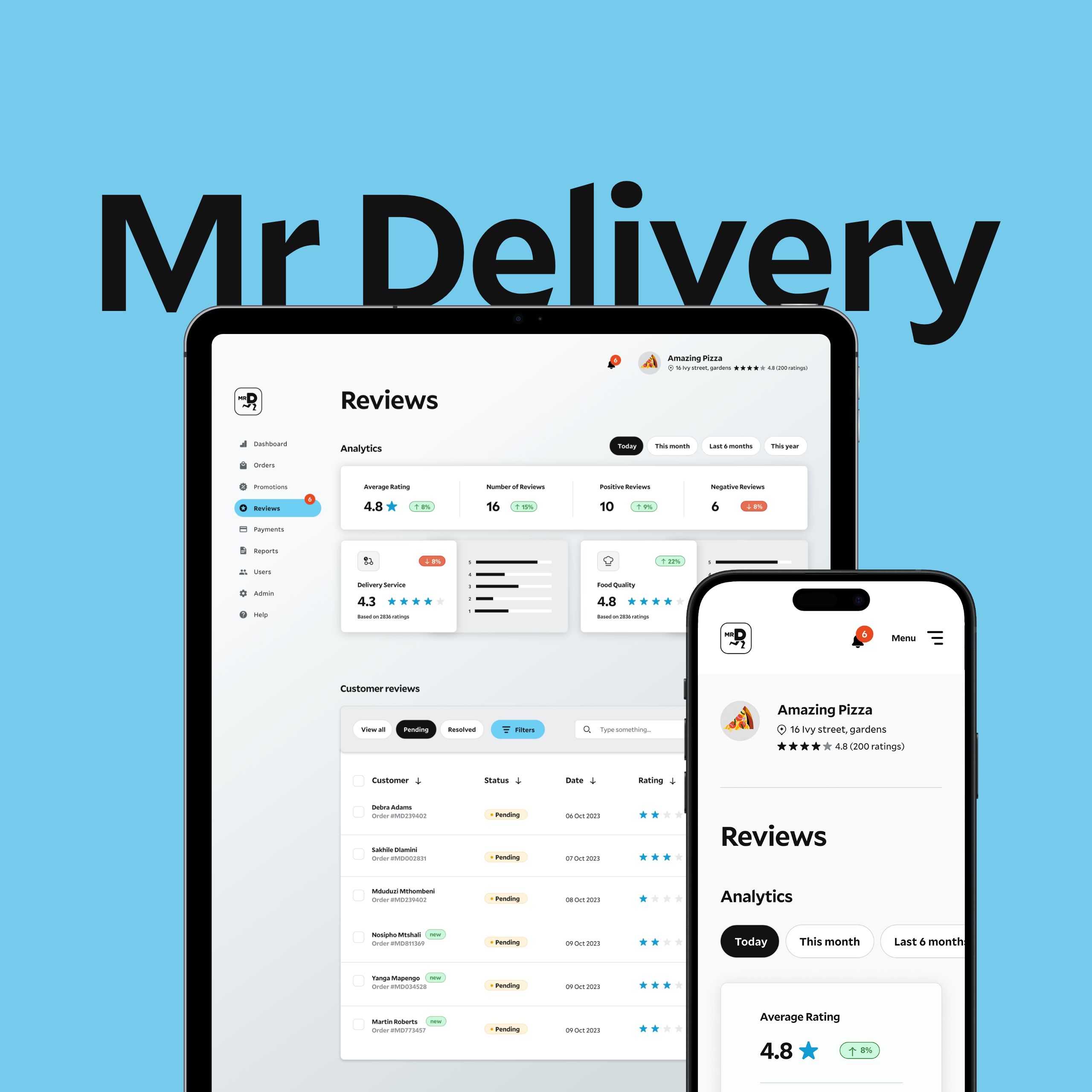
Client
Mr Delivery
My role
UI Design
Dashboard
Research and Analysis
Skills
Mr D is an on-demand business which provides convenience solutions to customers on a variety of products. It is a convenience-delivered marketplace that currently allows restaurants and Pick ‘n Pay grocery stores to list products and consumers to purchase food and groceries via a mobile device and have it delivered or collected across South Africa
The Scenario
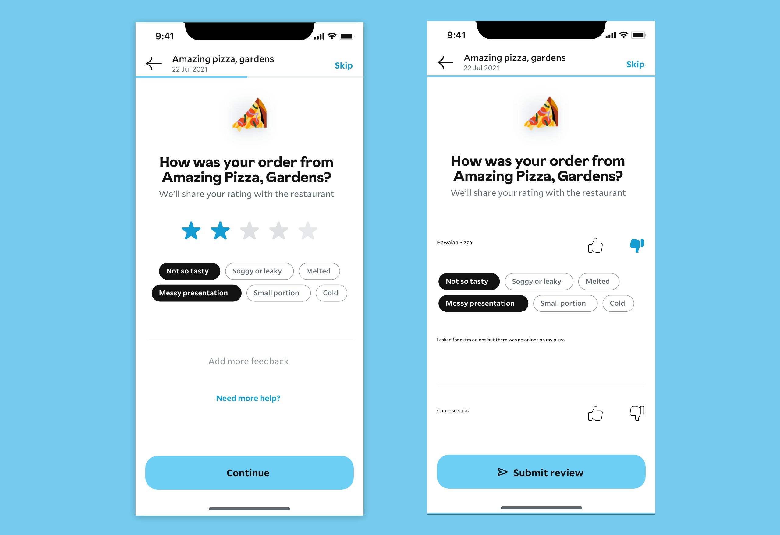
A customer has placed an order on the Mr D app. After the customer has received the order, the customer then reviews the restaurant and the individual food item. The customer was unsatisfied with the quality of the food and an individual item.
The Deliverables
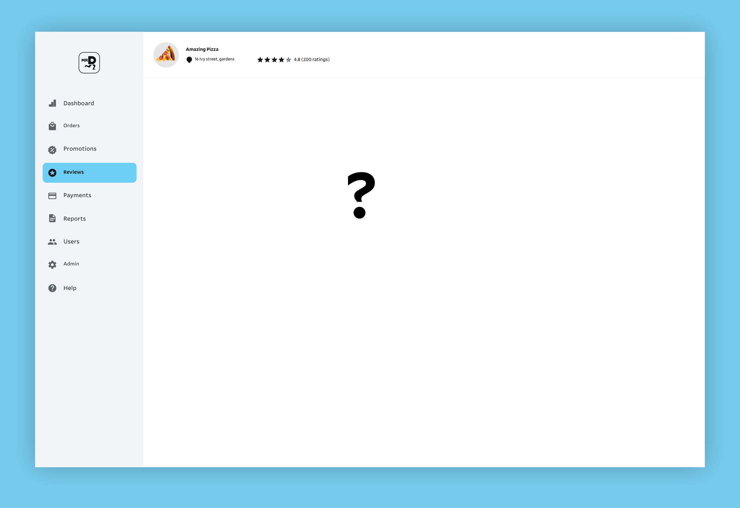
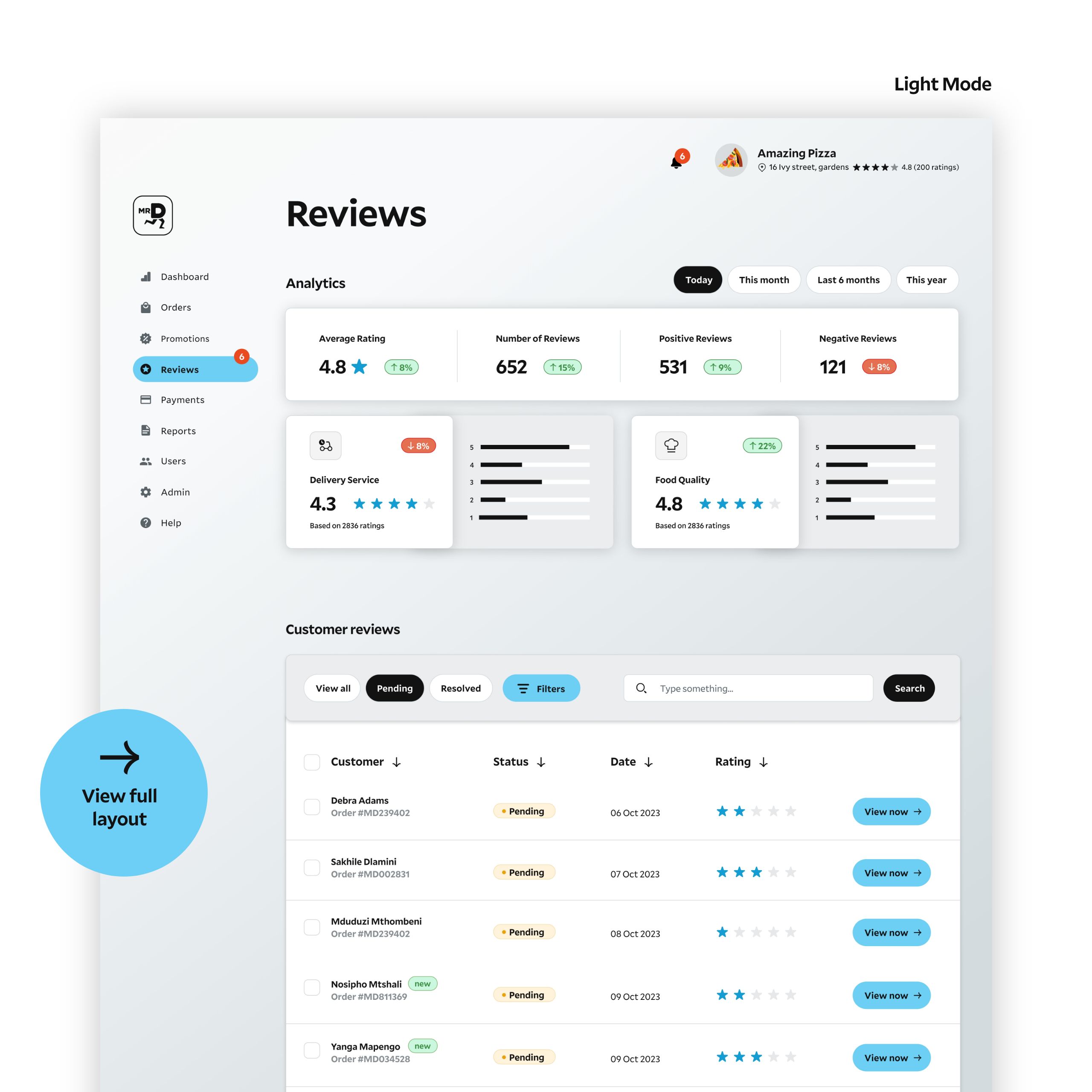
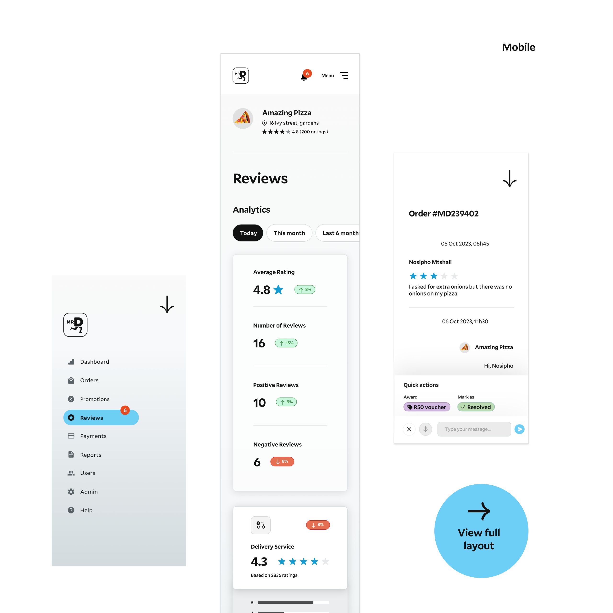
To design the customer review list page on the Mr D restaurant portal. This is where all reviews from customers are listed. Additionally, I needed to design the flow for viewing and responding to an individual customer review with a message and a voucher for desktop web and mobile web restaurant portal.
Research & Thinking
I started the process by doing a local competitor analysis. The idea was to see what technologies and trends the local businesses are utilising in this space.
The search was very difficult, although there’s an influx of delivery services in the country, there’s no way of telling what dashboard user experiences is being followed. And if they are utilising it, there’s no evidence of it on the internet.
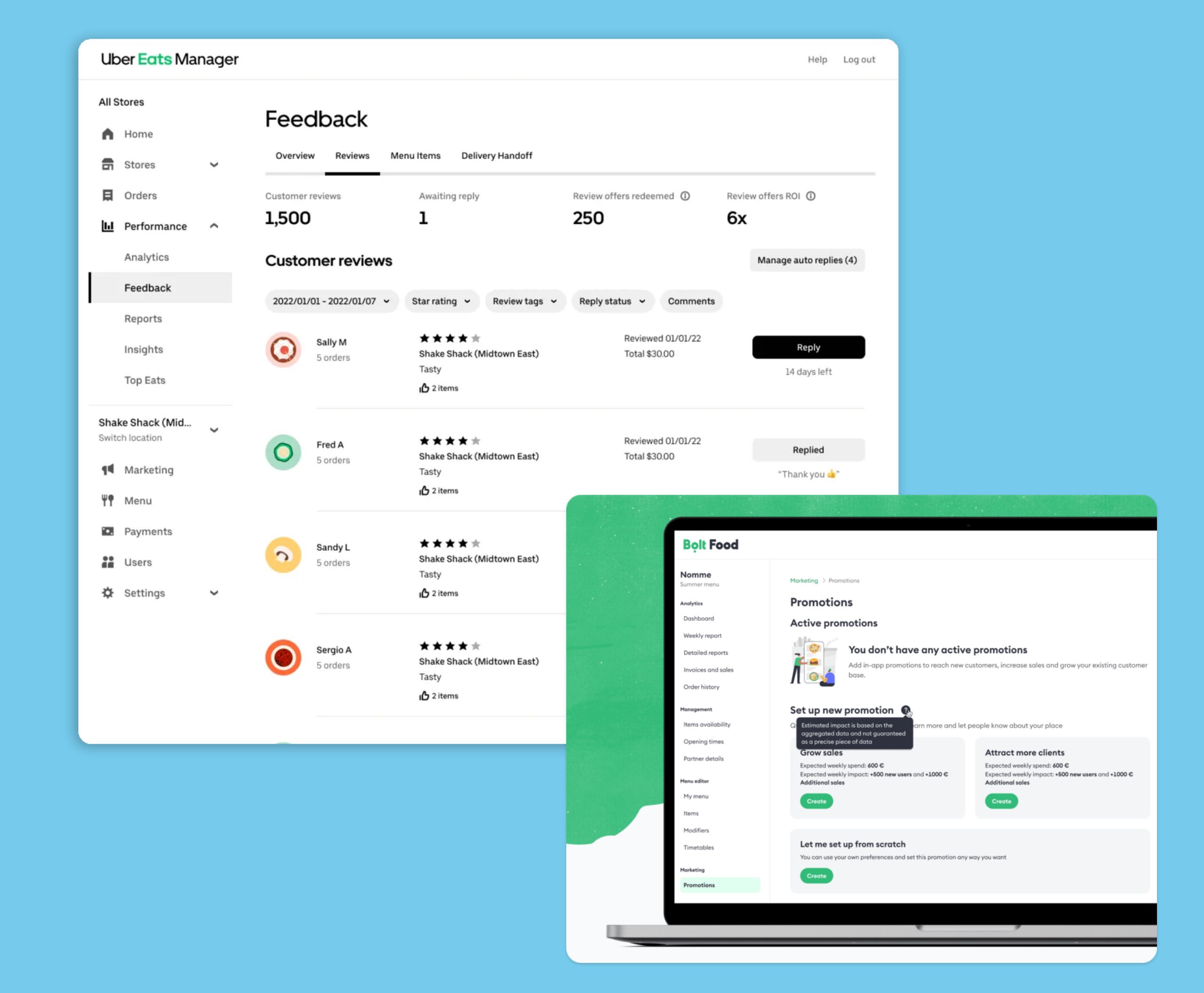
I did, however, find information through Mr D’s main competitor, Uber Eats. They had a lot of data available as well as visual references. It was interesting to note that it was very data driven. Data on food quality, delivery, packaging, loyalty and so on. Bolt Food also had information as well. Although minimal, they did provide useful information to restaurant owners and that assisted me while compiling my research.
The Inspiration
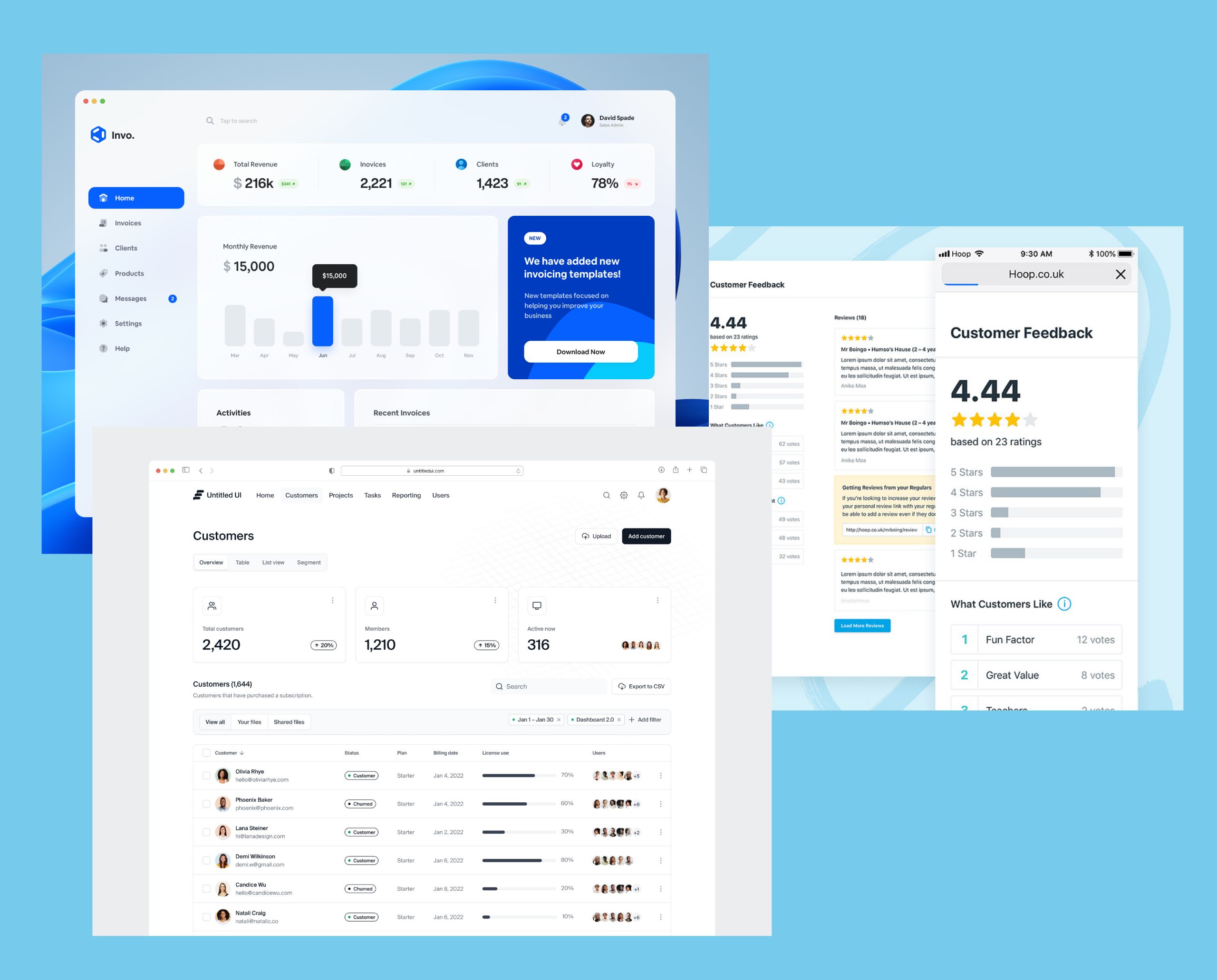
I also broadened my search and looked at visual dashboard treatments. The focus was to see what UI design elements I could use for dashboard and also keep abreast with what’s trending right now in the space. An interesting find was that data played a major part in design decisions. The dashboard elements are led with analytics. I also noticed reviews were grouped according to status (revised, pending, unanswered etc) and once a review was concluded it has a tag or a signifier showing it’s completed.
The Conclusion
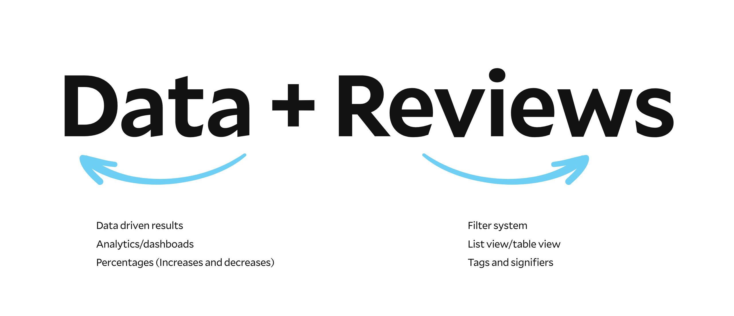
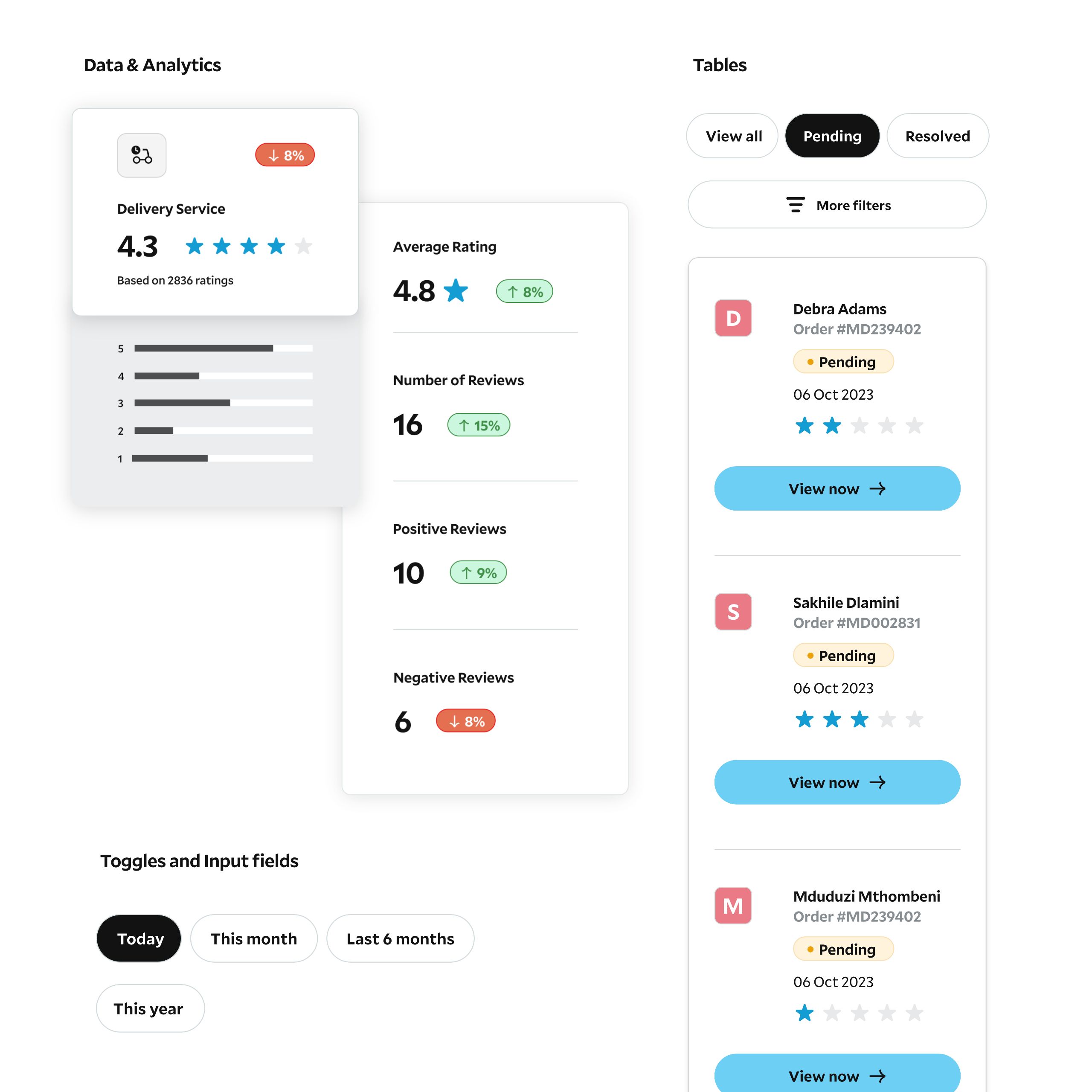
Data and analytics has to be championed. It needs to be the first thing restaurant owners see and everything else is secondary. Also, reviews have to be grouped and tagged according to their status.

Desktop & Mobile Layouts

Design System
Features
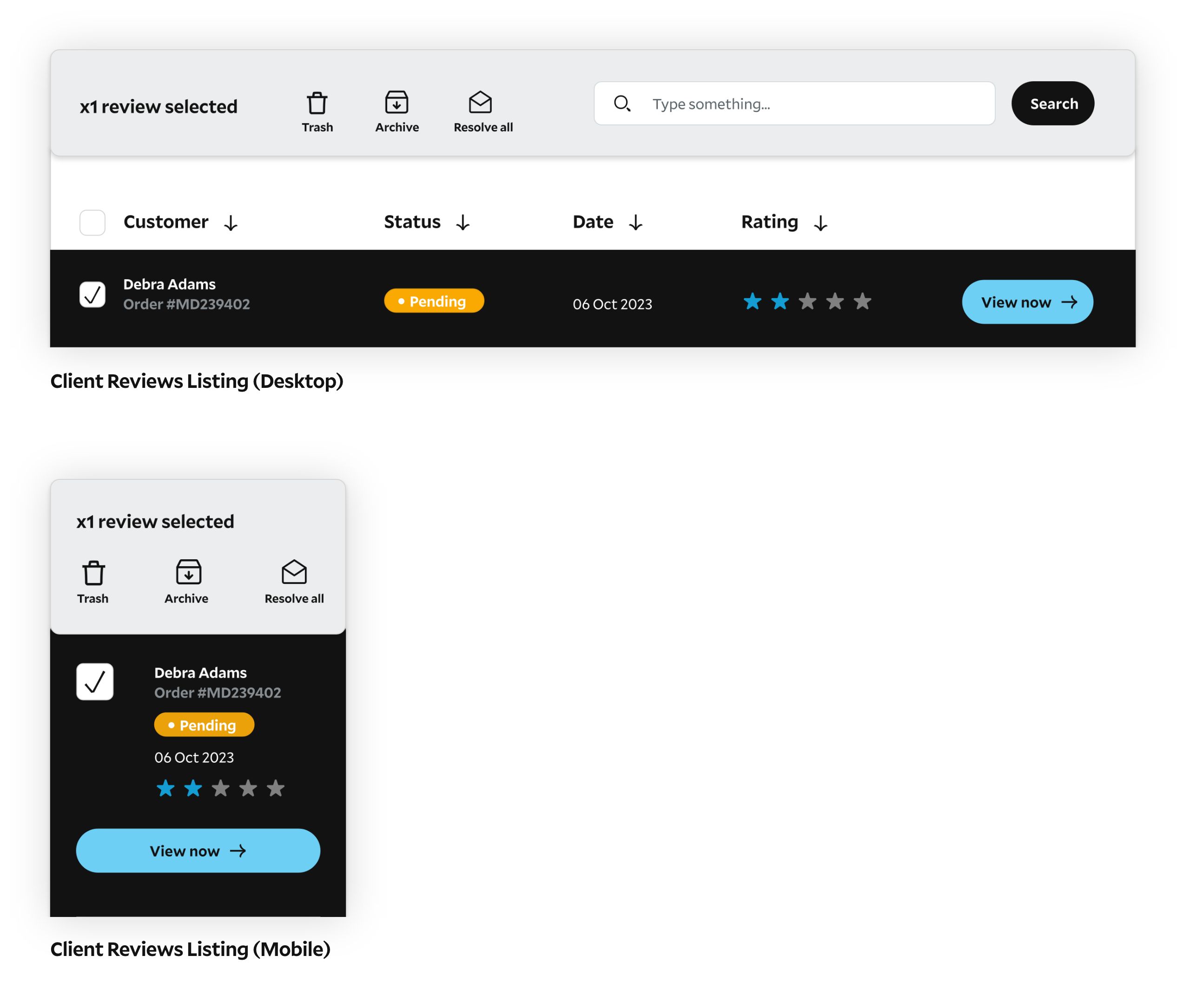
Checkbox selector
Data and analytics has to be championed. It needs to be the first thing restaurant owners see and everything else is secondary. Also, reviews have to be grouped and tagged according to their status.
Single Review
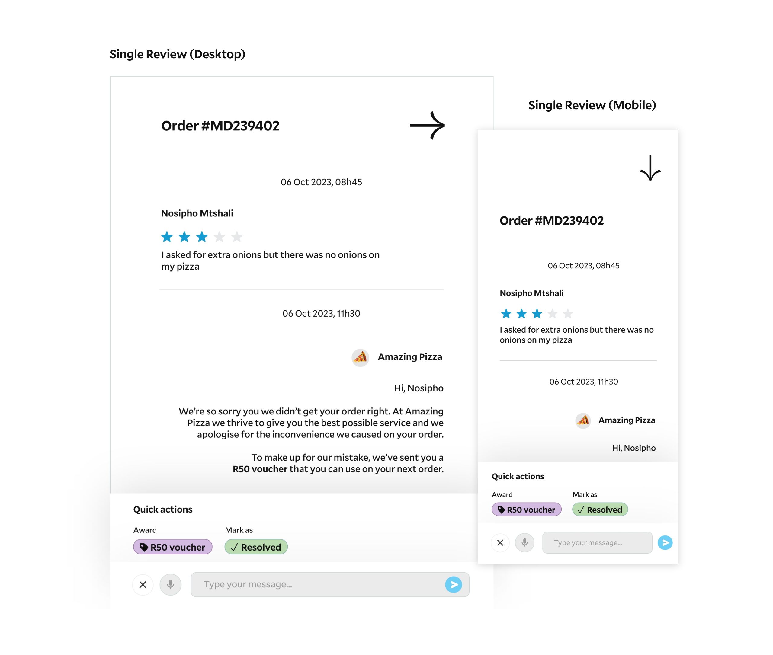
The idea here is that the review slides in from the left and it takes up as minimal space as possible. The chat is structured as a thread view with user chats on the left and restaurant replies on the right. Lastly the quick links at the bottom makes it easy to give a user a voucher or resolve their ticket.
Want to see the prototype?
View the desktop and mobile layouts below
Leave a Reply